examples
Background Images
background-position
The background-position property applies to block-level and replaced elements
and defaults to 0%, 0% (top, left).
There can be multiple background images. The first positioned image is called the origin image.
A position can be:
            [ [ left | center | right | top | bottom | <percentage> | <length> ]
          | [ left | center | right | <percentage> | <length> ]
            [ top | center | bottom | <percentage> | <length> ]
          | [ center | [ left | right ] [ <percentage> | <length> ]? ]
         && [ center | [ top | bottom ] [ <percentage> | <length> ]? ] ]
lengths: can be given in any valid unit: px em rem vw vh and always
represent where the image’s top, left corner is to be placed in relation to
the element’s background top, left (0,0) corner i.e. 20px 30px would move
the top, left corner of the image to the point 20px to the right of the
background’s left edge and 30px down from the background’s top edge.
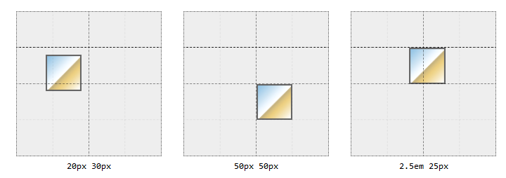
keywords: can appear in any order, singly or in pairs. When used in pairs
there must be a vertical and a horizontal i.e. top left or right bottom
percentages: percentage values apply to both the element’s background
and the image being positioned i.e. 50%, 50% will align the center of the
image with the center of the element’s background; 15%, 70% will align the
point of the image 15% from its own left edge and 70% from its own top edge with
the point 15% from the element’s background’s left edge and 70% from the
element’s background’s top edge, and so on. If only one percentage value is
given the other value is assumed to be for the vertical (y) position with a
value of 50%.
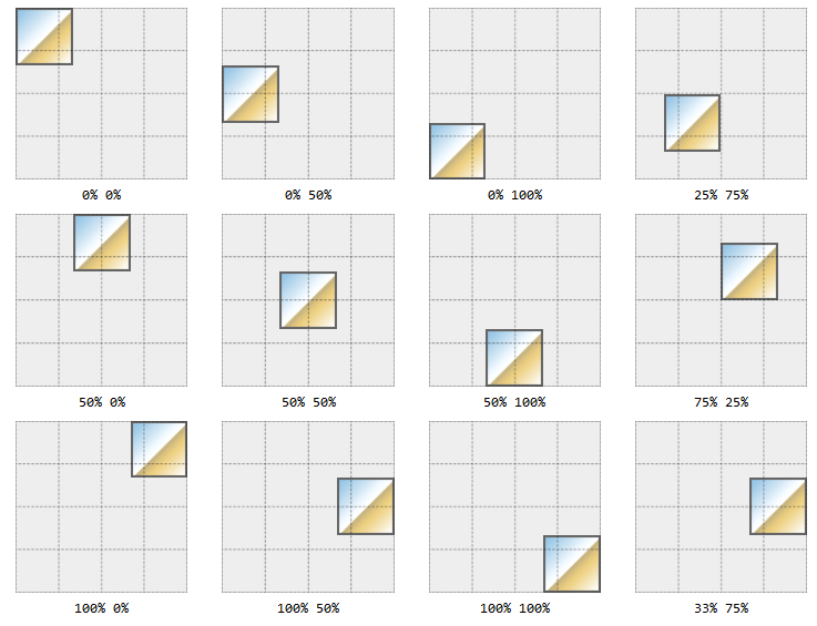
The percentages relate to the keywords: top left both equate to 0%,
bottom right both equate to 100%, center equates to 50%. So bottom left
would equate to 0% 100% since:
- bottom -> vertical -> 100%
- left -> horizontal -> 0%
- value pairs are always evaluated in horizontal (
x) and vertical (y) order ->(x,y) -> (0%, 100%)
Mixing Lengths, Keywords, and Percentages
You can mix length, keyword, and percentage values but order will matter in
such cases, the first value will always be taken as the horizontal, the second,
as the vertical and if the keyword is not in agreement the entire statement
will be ignored i.e. background-position: bottom 20% will be ignored; bottom
represents a vertical (y) value, not a horizontal (x) value.
Negative Position Values
Negative values will push the image outside of the element’s background viewing
area. Background images do not overflow, if you push the image or part of the
image past one or more of the background’s edges it will be hidden from view.
i.e. if an image is 100px by 100px and you only want to show the bottom, right
corner you can use background-position: -75px -75px to move the image’s top,
left corner 75px away from the the background’s top, left corner leaving only a
25px by 25px area viewable in the background’s top, left corner. (see a
Codepen Example)
Negative percentage values can also be used but if the element and the image are different sizes the results may not be quite what is expected. The same percentage values will apply to both the element and the image but the actual pixel correspondences will not.
Supplying a new offset origin
You can use four values to change the origin of the offset i.e.
left 33% top 30px equates to “move right 33% from the left and move down 30px
from the top edge” or right 25% bottom 30px which equates to “move left 25%
from the right edge and up 30px from the bottom edge”. Need to provide all four
values unless you want one of them to be zero i.e. right 25% bottom equates
to “move left 25% from the right edge and 0% from the bottom edge”.
You cannot use the center keyword in this context.
background-origin
Use the background-origin property to change the containing box reference
point to one of content-box, padding-box (default) or border-box.
This setting, along with background-repeat effects where tiling of repeated
background elements begins and ends. There are two other options, space and
round, that also affect tiling.
background-clip
Has the same three options as background-origin but describes the painting
area rather than the containing area. The key difference appears to be that
border-box is transparent when used as an origin but not when used as a
clipping area.
background-attachment
Has three options: fixed, scroll, and local. When fixed the background
is always visible in the viewport and is not affected by any scrolling.
Essentially, the background becomes the viewport’s background, not the
containing element’s background; however, once the containing element is
completely scrolled out of the viewport its background will disappear with it.
If set to local the background is fixed within the element and maintains its
position within the element as it is scrolled i.e. it can be scrolled in and out
of the viewport along with the element’s contents.
If set to scroll the viewport size has not effect on the background, it
retains its position in the element and moves with the scrolled contents.
background-size
Allows you to resize the image. Will take the values contain, cover, auto
or as (x,y) pairs in lengths or percentages. Percentage values use the
background-origin and not the background-clip area. Negative values are
ignored.
To maintain an image’s intrinsic aspect-ratio when setting a new size, leave one
dimension as auto, the implicit aspect-ratio will be used re-calculate the
dimension’s new size. i.e. if the original image is 300px by 200px it’s
intrinsic aspect-ration is 3:2. If we set background-size: 100px the new
height will be 66.67px (2/3 of 100px). If instead we set
background-size: auto 100px the image will be resized to 150px by 100px, the
width will be 1.5 (3/2) times the height.
If an image has no intrinsic size (gradients, some SVG’s) then the auto
dimension will default to 100% of the parent element’s size.
If set to cover the image will scale to completely over the background’s
positioning area. The intrinsic aspect-ratio is retained (which does not happen
if we use 100%,100%).
If set to contain the image will be scaled to fit within the element’s
background positioning area. Again, the intrinsic aspect-ratio is retained.
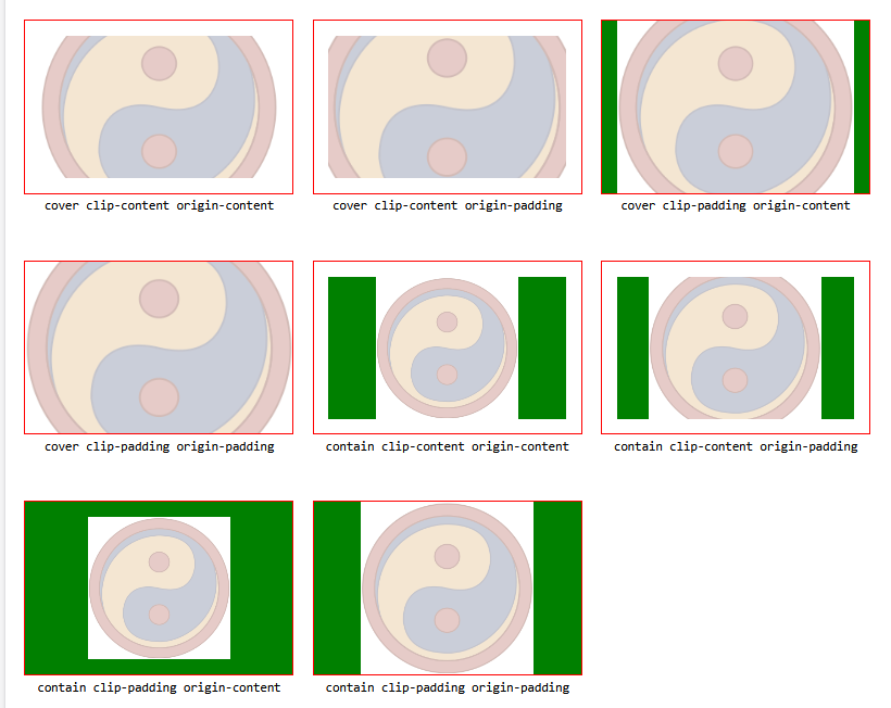
The green is the difference between the background-clip area and the
background-origin area.
background
The shortcut for background properties is:
  <bg-layer> = <bg-image> ‖ <position> [ / <bg-size> ]?
             ‖ <repeat-style>
             ‖ <attachment>
             ‖ <box> (background-origin)
             ‖ <box> (background-clip)

  <final-bg-layer> = <bg-image>
                   ‖ <position> [ /  <bg-size> ]?
                   ‖ <repeat-style>
                   ‖ <attachment>
                   ‖ <box> (background-origin)
                   ‖ <box> (background-clip)
                   ‖ <background-color>
If only one <box> value is given it applies to both background-clip and
background-origin.
Note that if any option is omitted it defaults back to its initial setting.
Multiple Backgrounds
Define multiple images as comma separated values, you can have as many as you want with the exception that only one background colour can be declared.
Layers can be defined using background shorthand or by setting individual properties.
section {
  background-image: url(bg01.png), url(bg02.gif), url(bg03.jpg);
  background-position: top right, left center, 50% 100%;
  background-repeat: no-repeat, no-repeat, repeat-x;
  background-color: green;
}
is equivalent to:
section {
  background: url(bg01.png) right top no-repeat, url(bg02.gif) center left
      no-repeat, url(bg03.jpg) 50% 100% repeat-x green;
}
Note that the number of images sets the number of layers. If you set properties individually, missing values are assumed. For example,
section {
  background-image: url(one.png), url(two.png);
  background-repeat: no-repeat;
  background-position: top left;
}
is interpreted as:
section {
  background-image: url(one.png), url(two.png);
  background-repeat: no-repeat, no-repeat;
  background-position: top left, top left;
}
The layers stack up, with the first layer being the bottom most and the only one
which can have a background color. In the above example, one.png will sit on
top of two.png with both positioned in the top, left corner.
Gradients
Linear Gradients
Gradients are also considered to be images.
      linear-gradient(
          [[ <angle> | to <side-or-quadrant> ],]?
          [ <color-stop> [, <color-hint>]? ]# ,
          <color-stop>
      )
The direction always points to the gradient line direction. You can use rgba()
or hsla to fade to a transparency instead of solid colour.
div {
  background-image: linear-gradient(
    to right,
    rgba(200, 200, 200, 1),
    rgba(200, 200, 200, 0)
  );
}
Each layer can have only one angle or direction but multiple colours and stops. The following creates stripes:
.stripes {
  background-image: linear-gradient(
    90deg,
    gray 0%,
    gray 25%,
    transparent 25%,
    transparent 50%,
    gray 50%,
    gray 75%,
    transparent 75%,
    transparent 100%
  );
}
Colour Hints
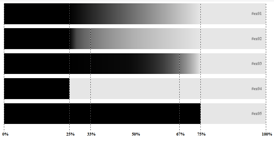
Colour hints can be used to change the linear progression of a gradient. Normally there is a smooth transition from one shade to another with the colour between two stops being the mid-value between the colours on either side of the stop. This can be altered by adding stops. For example,
#ex01 {
  background: linear-gradient(to right, #000 25%, rgb(90%, 90%, 90%) 75%);
}
#ex02 {
  background: linear-gradient(to right, #000 25%, 33%, rgb(90%, 90%, 90%) 75%);
}
#ex03 {
  background: linear-gradient(to right, #000 25%, 67%, rgb(90%, 90%, 90%) 75%);
}
#ex04 {
  background: linear-gradient(to right, #000 25%, 25%, rgb(90%, 90%, 90%) 75%);
}
#ex05 {
  background: linear-gradient(to right, #000 25%, 75%, rgb(90%, 90%, 90%) 75%);
}
generates
Radial Gradients
  radial-gradient(
    [ [ <shape> ‖ <size> ] [ at <position>]? , | at <position>, ]?
    [ <color-stop> [, <color-hint>]? ] [, <color-stop> ]+
)
Radial gradients can have one of two shapes: circle or ellipse, and can be sized. By default, the gradient is centered.
An ellipse requires two positions, one for the horizontal axis, the other for the vertical axis. Percentage values can only be used with ellipses.
There are four keywords that can be used: closest-side, farthest-side, closes-corner, farthest-corner. For circles, the gradient ray will touch the side/corner closest/farthest from the circle’s center. For ellispes, the gradient ray touches the closest/farthest side from the horizontal and vertical axes. For corners, it uses the one closest/farthest from the center and adjusts the other axes accordingly.
You can alter the gradient origin using position offsets i.e. top left, bottom right, 30px 50px, etc. You can also use colour stops and colour hints.
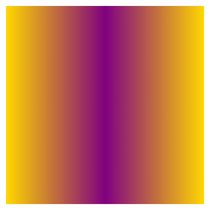
You can create a mirrored gradient by using a zero width:
radial-gradient(0px 50% at center, purple 0px, gold 100px)
Gradients can also be used to create a tiling effect:
body {
  background: tan center/25px 25px repeat radial-gradient(circle at center, rgba(0, 0, 0, 0.1), rgba(
          0,
          0,
          0,
          0.1
        ) 10px, transparent 10px, transparent);
}
produces a dot pattern:

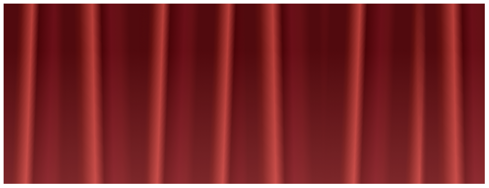
section {
  background-image: linear-gradient(
      0deg,
      rgba(255, 128, 128, 0.25),
      transparent 75%
    ), linear-gradient(
      89deg,
      transparent,
      transparent 30%,
      #510a0e 35%,
      #510a0e 40%,
      #61100f 43%,
      #b93f3a 50%,
      #4b0408 55%,
      #6a0f18 60%,
      #651015 65%,
      #510a0e 70%,
      #510a0e 75%,
      rgba(255, 128, 128, 0) 80%,
      transparent
    ), linear-gradient(92deg, #510a0e, #510a0e 20%, #61100f 25%, #b93f3a 40%, #4b0408
        50%, #6a0f18 70%, #651015 80%, #510a0e 90%, #510a0e);
  background-size: auto, 300px 100%, 109px 100%;
  background-repeat: repeat-x;
}
produces a curtain effect:
There are also repeating gradient functions: repeating-linear-gradient() and
repeating-radial-gradient()
For more notes on gradients see shapes
References:
- CSS: The Definitive Guide, 4th Edition by Eric A. Meyer and Estelle Weyl
- images clipped from the books example pages